function show_box(section) {
var sections = [“services”, “case_studies”, “insights”, “about_us”]
for (let s of sections) {
let boxOfLinks = document.getElementById(s + ‘-box’)
if (s == section) {
boxOfLinks.style.display = ‘flex’
} else {
boxOfLinks.style.display = ‘none’
}
}
}
function hide_box(section) {
let boxOfLinks = document.getElementById(section + ‘-box’)
boxOfLinks.style.display = ‘none’
}
function toggle_box_of_links(section){
let boxOfLinks = document.getElementById(section + ‘-box’)
let display = boxOfLinks.style.display
if(display == ‘flex’){
hide_box(section)
}else if(display == ‘none’){
show_box(section)
}
}

POST
![]()
![]()
![]()
header .social-container{position:absolute;top:50%;left:70px;transform:translateY(-50%);display:flex;flex-direction:column;align-items:center}@media screen and (min-width: 1610px){header .social-container{display:none}}@media screen and (max-width: 1200px) and (min-width: 769px){header .social-container{display:none}}@media screen and (max-width: 768px){header .social-container{display:none}}header .social-container>a{padding:4px;display:inline-flex;justify-content:center;align-items:center}header .social-container>a:nth-child(n+4){margin-top:4px}
/*# sourceMappingURL=header-social-container.css.map */
![]()
![]()
![]()
![]()
![]()
The Importance of Data Visualisation for PR and How to Create a Compelling One
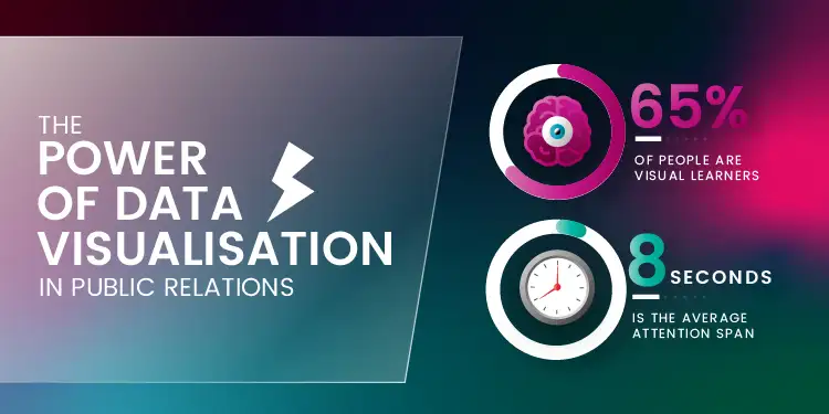
When you are viewing a piece of content, let’s say a blog post for example, the first thing that stands out is any kind of image or video on that page. This shouldn’t come as a surprise to at least 65% of us, as this is the percentage of the population who consider themselves visual learners.
When it comes to outreaching press releases, having a compelling infographic is even more important, perhaps almost as important as the content itself. They will definitely give your PR a boost when it comes to outreach, and get the attention of the person reading it more than a simple block of text would. Here is why data vitalisation is very important in creating a successful PR campaign that is sure to be picked up by the press.
The Power of Data Visualisation in Public Relations

They grab attention
Journalists receive hundreds of PRs on a daily basis and if you don’t want yours to get lost in the imbox or sent straight to junk, you need to make sure it stands out from the crowd. A compelling PR graphic has the power to do that. Studies have shown that a persons’ attention span is under 10 seconds, so having an infographic that is eye-catching will give you a big advantage.
They simplify complex information
When you have a very data-heavy piece, a PR infographic can make that data easier to digest. A bunch of numbers and statistics, while very interesting, can also be off putting to a journalist who doesn’t have much time to go through all the emails and it might make them lose interest quickly. Having an infographic that presents the data simply and to the point, while looking visually pleasing, will not only appeal to a journalist but also to any readers who might be interested in checking out your site after.
They are sharable and great for link building
It’s said that 90% of the information transmitted to the brain is visual, and good journalists are aware of the power of visual representation. Think about yourself, when you are reading a news article or browsing your social media, the first thing that catches your eye is usually an image or video. Adding an infographic to a press release will make it more likely to be published and shared online on different social media outlets, which is very likely to lead to plenty of backlinks to your website. And we all know how important link building is from an SEO view point.
They create brand awareness
Utilising graphic in your Digital PR efforts is a great way to create awareness of your brand by using your brands’ colours and logos. This way, when people will start seeing your infographics online, they are very likely to be interested in learning more about you do, and even easily associate the brand with the logos and colours.
What Differentiates a Bad PR Infographic from a Good One?
We asked our in-house graphic designer, Scott Bowman, for his opinion on the power of data visualisation. He believes that a good Public Relations’ infographic ‘can take complex data that could be otherwise hard to  understand and make it easier to digest visually’.
‘Less is more’ he believes, and this is also a great tip for novice graphic designers who are just starting their careers. ‘Having an infographic that’s bursting with too much information or too visually heavy would make a reader lose interest immediately. Simplicity is the way to go, combined of course with innovative visuals that will kindle the readers’ interest in the topic.’
‘You need to also make sure that you know your audience when starting a design. If it’s data-heavy and tackling a more serious topic, the graphic should compliment that. Having an infographic that it’s totally inappropriate to the topic will put people off.’
![]()
![]()
![]()
Leave a Reply